Région
Nouvelle-
Aquitaine
Redesigning a school transport platform for time-pressed parents.
UX Research
UX Design
Overview
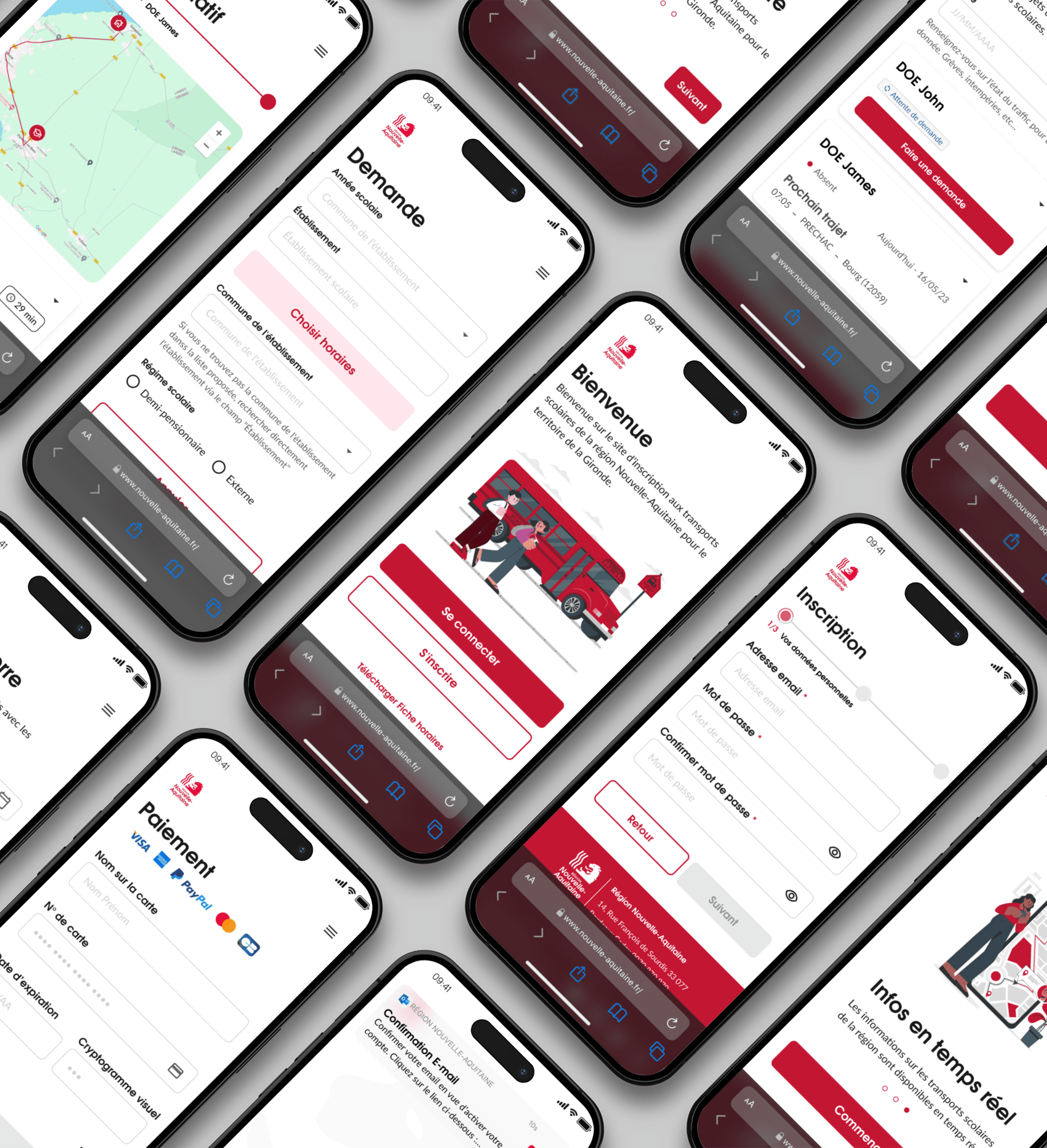
For the 2024 school year, the Nouvelle-Aquitaine Region aimed to redesign its school transport platform. Their goal is to strengthen brand consistency and place a greater emphasis on user experience.
The goal was to redesign the application to reduce friction, better meet parents' expectations, improve accessibility and overall usability. Alongside the design, building a scalable and sustainable design system and documentation to enable a smooth multidisciplinary collaboration between product, design and development teams.
Role
UX Research · UX/UI Design · Design System · Documentation
End-to-end product ownership
Users
Time restricted parents with strong expectations around efficiency, clarity, and reliability.

Challenges
Frictions
The existing interface no longer met user expectations in terms of clarity and ease of use leading to confusion and errors.
Technical and performance limitations affected task completion
Accessibility standards were not fully met, excluding some users
Lack of visual consistency reduced perceived reliability of the service
Goals
Address usability gaps identified in the existing interface
Minimize performance-related friction impacting user efficiency
Ensure inclusive access while reinforcing perceived reliability and trust
Establish visual consistency to strengthen brand recognition
Persona
What for ?
The persona helped us represent typical users to guide design and development by better understanding their needs and expectations based on the various user interviews.


Audit
Challenge
The UX audit was conducted upfront to identify structural usability, accessibility, and consistency issues, and to inform the definition of testing scenarios and interview guides.
Results
Design a more comprehensive onboarding flow to strengthen brand credibility and build user trust from the first interaction.
Make actions more explicit and visible to enable smoother navigation and reduce cognitive load.
Reinforce content hierarchy to help users quickly understand the interface, maintain their bearings, and complete tasks more efficiently.
Apply Gestalt principles more consistently to improve visual grouping, separation, and information scanning, allowing users to find what they need faster.
Comply with WCAG 2.1 success criterion 1.4.3 by ensuring a minimum contrast ratio of 4.5:1 for standard text and 3:1 for large text, improving readability and accessibility for users with visual impairments and supporting a more inclusive experience.


User Interviews
Approach
Semi-structured interviews with parents to explore their expectations, uncover pain points, understand routines, and gather expectations around usability, clarity, and and reliability of the transport service.
Key insighs and results
User interviews revealed critical insights that directly informed both the product redesign and the creation of a scalable design system and documentation.
Device usage
Mobile usage dominated, leading to a mobile-first UX strategy and the creation of touch-friendly, responsive components and layout guidelines within the design system.
Usage frequency
Daily usage required instant access to key information, driving the prioritization of efficiency-focused layouts and navigation patterns.
Core features
Schedules, notifications, and route search were identified as critical journeys, shaping interface hierarchy and standardized interaction patterns.
Pain points
Small touch targets and unclear navigation highlighted the need for stronger accessibility standards, clearer interaction cues, and ergonomic system rules.
Overall perception
Moderate satisfaction revealed opportunities to improve clarity, consistency, and perceived reliability through stronger visual and interaction design.
User suggestions
Requests for saved routes and personalized alerts guided the design of scalable personalization patterns within the system.
User Tests
Approach
Scenario-based usability tests with parents to assess clarity, ease of use, and error prevention when completing school transport–related tasks in the transport app.
Problem statement
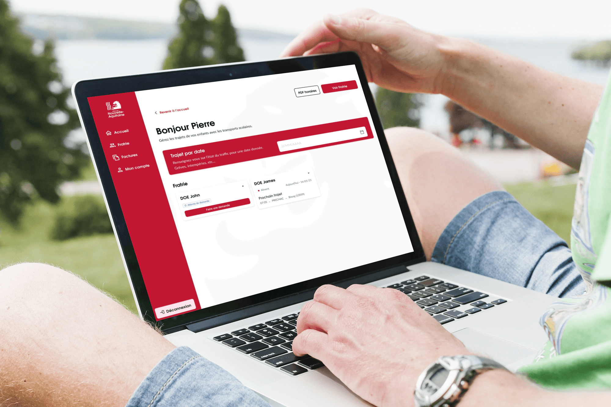
Evaluate how parents complete critical tasks in the app (e.g., registering children, managing subscriptions)
Identify friction points and errors in the user journey
Assess clarity, feedback, and ease of use of the platform
Gather insights to refine features, flows, and the overall experience

Insights
Main UX Recommendations
Simplify user flows and reduce cognitive load
Integrate timetables directly into ride requests
Redesign CTA hierarchy, wording, and layout
Improve content prioritization and information architecture
Enable PDF download of schedules for frequent use
Apply mobile-first ergonomics, touch-friendly spacing, and accessibility standards (WCAG contrast)
Key Problems Identified
Complex and unclear child ride request flow
High cognitive load when consulting schedules
Poor CTA hierarchy, wording, and placement
Lack of schedule integration inside requests
Insufficient mobile ergonomics and accessibility
Low relevance of homepage content hierarchy
Outcome
Impact on User Experience
The design improvements led to a smoother, more intuitive experience for users. Key impacts included:
Faster task completion – Parents and children can check schedules and manage transport quickly and efficiently.
Clearer understanding of actions – Users know exactly what to do at every step.
Reduced friction and errors – Thoughtful feedback and guidance minimize mistakes and frustration.
Increased trust and reliability – Users feel confident that the system works for them.
Design System & Documentation Outcomes
To ensure consistency and scalability, I developed a mobile-first component library and comprehensive documentation:
CTA hierarchy and interaction rules – Clear calls-to-action guide users effectively.
Touch-friendly spacing and layouts – Interfaces feel natural and easy to interact with on mobile.
Timetable input patterns – Streamlined for quick schedule management.
Accessibility standards integration – Everyone can use the system comfortably.
Benefits
The result is a more usable, engaging, and personalized experience for families:
This project demonstrates how thoughtful UX design, combined with a strong design system, can transform complex workflows into experiences that feel natural, reliable, and seamless.
Interactions are simpler and more intuitive, especially on mobile.
Users complete tasks faster, with fewer errors.
The system provides clear guidance and meaningful feedback, reducing stress.
Parents and children receive relevant, personalized information that supports their daily routines.


Key Learnings
Takeaways
Strategic mobile-first thinking drives efficiency – Designing with a mobile-first mindset ensured critical tasks were completed faster, aligning the product with the needs of time-constrained parents.
Intentional hierarchy and interaction design reduce errors – Thoughtful CTA placement, wording, and content prioritization minimized cognitive load and improved task success, reinforcing user trust.
Accessibility strengthens both inclusion and credibility – Integrating WCAG standards enhanced usability for all users while signaling the platform’s reliability and commitment to equity.
Research-informed systems create scalable solutions – User insights guided not only interface improvements but also the development of a reusable, maintainable design system for cross-team collaboration.
Documentation and process leadership drive consistency – Providing clear design guidelines and interaction rules enabled multidisciplinary teams to deliver a coherent experience at scale.
Région
Nouvelle-
Aquitaine
Redesigning a school transport platform for time-pressed parents.
UX Research
UX Design
Overview
For the 2024 school year, the Nouvelle-Aquitaine Region aimed to redesign its school transport platform. Their goal is to strengthen brand consistency and place a greater emphasis on user experience.
The goal was to redesign the application to reduce friction, better meet parents' expectations, improve accessibility and overall usability. Alongside the design, building a scalable and sustainable design system and documentation to enable a smooth multidisciplinary collaboration between product, design and development teams.
Role
UX Research · UX/UI Design · Design System · Documentation
End-to-end product ownership
Users
Time restricted parents with strong expectations around efficiency, clarity, and reliability.


Challenges
Frictions
The existing interface no longer met user expectations in terms of clarity and ease of use leading to confusion and errors.
Technical and performance limitations affected task completion
Accessibility standards were not fully met, excluding some users
Lack of visual consistency reduced perceived reliability of the service
Goals
Address usability gaps identified in the existing interface
Minimize performance-related friction impacting user efficiency
Ensure inclusive access while reinforcing perceived reliability and trust
Establish visual consistency to strengthen brand recognition
Persona
What for ?
The persona helped us represent typical users to guide design and development by better understanding their needs and expectations based on the various user interviews.


Audit
Challenge
The UX audit was conducted upfront to identify structural usability, accessibility, and consistency issues, and to inform the definition of testing scenarios and interview guides.
Results
Design a more comprehensive onboarding flow to strengthen brand credibility and build user trust from the first interaction.
Make actions more explicit and visible to enable smoother navigation and reduce cognitive load.
Reinforce content hierarchy to help users quickly understand the interface, maintain their bearings, and complete tasks more efficiently.
Apply Gestalt principles more consistently to improve visual grouping, separation, and information scanning, allowing users to find what they need faster.
Comply with WCAG 2.1 success criterion 1.4.3 by ensuring a minimum contrast ratio of 4.5:1 for standard text and 3:1 for large text, improving readability and accessibility for users with visual impairments and supporting a more inclusive experience.


User Interviews
Approach
Semi-structured interviews with parents to explore their expectations, uncover pain points, understand routines, and gather expectations around usability, clarity, and and reliability of the transport service.
Key insighs and results
User interviews revealed critical insights that directly informed both the product redesign and the creation of a scalable design system and documentation.
Device usage
Mobile usage dominated, leading to a mobile-first UX strategy and the creation of touch-friendly, responsive components and layout guidelines within the design system.
Usage frequency
Daily usage required instant access to key information, driving the prioritization of efficiency-focused layouts and navigation patterns.
Core features
Schedules, notifications, and route search were identified as critical journeys, shaping interface hierarchy and standardized interaction patterns.
Pain points
Small touch targets and unclear navigation highlighted the need for stronger accessibility standards, clearer interaction cues, and ergonomic system rules.
Overall perception
Moderate satisfaction revealed opportunities to improve clarity, consistency, and perceived reliability through stronger visual and interaction design.
User suggestions
Requests for saved routes and personalized alerts guided the design of scalable personalization patterns within the system.
User Tests
Approach
Scenario-based usability tests with parents to assess clarity, ease of use, and error prevention when completing school transport–related tasks in the transport app.
Problem statement
Evaluate how parents complete critical tasks in the app (e.g., registering children, managing subscriptions)
Identify friction points and errors in the user journey
Assess clarity, feedback, and ease of use of the platform
Gather insights to refine features, flows, and the overall experience


Insights
Main UX Recommendations
Simplify user flows and reduce cognitive load
Integrate timetables directly into ride requests
Redesign CTA hierarchy, wording, and layout
Improve content prioritization and information architecture
Enable PDF download of schedules for frequent use
Apply mobile-first ergonomics, touch-friendly spacing, and accessibility standards (WCAG contrast)
Key Problems Identified
Complex and unclear child ride request flow
High cognitive load when consulting schedules
Poor CTA hierarchy, wording, and placement
Lack of schedule integration inside requests
Insufficient mobile ergonomics and accessibility
Low relevance of homepage content hierarchy
Outcome
Impact on User Experience
The design improvements led to a smoother, more intuitive experience for users. Key impacts included:
Faster task completion – Parents and children can check schedules and manage transport quickly and efficiently.
Clearer understanding of actions – Users know exactly what to do at every step.
Reduced friction and errors – Thoughtful feedback and guidance minimize mistakes and frustration.
Increased trust and reliability – Users feel confident that the system works for them.
Design System & Documentation Outcomes
To ensure consistency and scalability, I developed a mobile-first component library and comprehensive documentation:
CTA hierarchy and interaction rules – Clear calls-to-action guide users effectively.
Touch-friendly spacing and layouts – Interfaces feel natural and easy to interact with on mobile.
Timetable input patterns – Streamlined for quick schedule management.
Accessibility standards integration – Everyone can use the system comfortably.
Benefits
The result is a more usable, engaging, and personalized experience for families:
This project demonstrates how thoughtful UX design, combined with a strong design system, can transform complex workflows into experiences that feel natural, reliable, and seamless.
Interactions are simpler and more intuitive, especially on mobile.
Users complete tasks faster, with fewer errors.
The system provides clear guidance and meaningful feedback, reducing stress.
Parents and children receive relevant, personalized information that supports their daily routines.


Key Learnings
Takeaways
Strategic mobile-first thinking drives efficiency – Designing with a mobile-first mindset ensured critical tasks were completed faster, aligning the product with the needs of time-constrained parents.
Intentional hierarchy and interaction design reduce errors – Thoughtful CTA placement, wording, and content prioritization minimized cognitive load and improved task success, reinforcing user trust.
Accessibility strengthens both inclusion and credibility – Integrating WCAG standards enhanced usability for all users while signaling the platform’s reliability and commitment to equity.
Research-informed systems create scalable solutions – User insights guided not only interface improvements but also the development of a reusable, maintainable design system for cross-team collaboration.
Documentation and process leadership drive consistency – Providing clear design guidelines and interaction rules enabled multidisciplinary teams to deliver a coherent experience at scale.
Overview
For the 2024 school year, the Nouvelle-Aquitaine Region aimed to redesign its school transport platform. Their goal is to strengthen brand consistency and place a greater emphasis on user experience.
The goal was to redesign the application to reduce friction, better meet parents' expectations, improve accessibility and overall usability. Alongside the design, building a scalable and sustainable design system and documentation to enable a smooth multidisciplinary collaboration between product, design and development teams.
Overview
UX Research
UX Design
Introduction
Research and gamification
Région Nouvelle -Aquitaine
Redesigning a school transport platform for time-pressed parents.
Role
UX Research · UX/UI Design · Design System · Documentation
End-to-end product ownership
UX Research · UX/UI Design · Design System · Documentation
End-to-end product ownership
Users
Time restricted parents with strong expectations around efficiency, clarity, and reliability.
Time restricted parents with strong expectations around efficiency, clarity, and reliability.


Challenges
Frictions
The existing interface no longer met user expectations in terms of clarity and ease of use leading to confusion and errors.
Technical and performance limitations affected task completion
Accessibility standards were not fully met, excluding some users
Lack of visual consistency reduced perceived reliability of the service
Goals
Address usability gaps identified in the existing interface
Minimize performance-related friction impacting user efficiency
Ensure inclusive access while reinforcing perceived reliability and trust
Establish visual consistency to strengthen brand recognition
Address usability gaps identified in the existing interface
Minimize performance-related friction impacting user efficiency
Ensure inclusive access while reinforcing perceived reliability and trust
Establish visual consistency to strengthen brand recognition
Persona
What for ?
The persona helped us represent typical users to guide design and development by better understanding their needs and expectations based on the various user interviews.
The persona helped us represent typical users to guide design and development by better understanding their needs and expectations based on the various user interviews.


Audit
Challenge
The UX audit was conducted upfront to identify structural usability, accessibility, and consistency issues, and to inform the definition of testing scenarios and interview guides.
The UX audit was conducted upfront to identify structural usability, accessibility, and consistency issues, and to inform the definition of testing scenarios and interview guides.
Results
Design a more comprehensive onboarding flow to strengthen brand credibility and build user trust from the first interaction.
Make actions more explicit and visible to enable smoother navigation and reduce cognitive load.
Reinforce content hierarchy to help users quickly understand the interface, maintain their bearings, and complete tasks more efficiently.
Apply Gestalt principles more consistently to improve visual grouping, separation, and information scanning, allowing users to find what they need faster.
Comply with WCAG 2.1 success criterion 1.4.3 by ensuring a minimum contrast ratio of 4.5:1 for standard text and 3:1 for large text, improving readability and accessibility for users with visual impairments and supporting a more inclusive experience.


User Interviews
Approach
Semi-structured interviews with parents to explore their expectations, uncover pain points, understand routines, and gather expectations around usability, clarity, and learning effectiveness.
Semi-structured interviews with parents to explore their expectations, uncover pain points, understand routines, and gather expectations around usability, clarity, and learning effectiveness.
Key insighs and results
User interviews revealed critical insights that directly informed both the product redesign and the creation of a scalable design system and documentation.
User interviews revealed critical insights that directly informed both the product redesign and the creation of a scalable design system and documentation.
Device usage
Mobile usage dominated, leading to a mobile-first UX strategy and the creation of touch-friendly, responsive components and layout guidelines within the design system.
Usage frequency
Daily usage required instant access to key information, driving the prioritization of efficiency-focused layouts and navigation patterns.
Core features
Schedules, notifications, and route search were identified as critical journeys, shaping interface hierarchy and standardized interaction patterns.
Pain points
Small touch targets and unclear navigation highlighted the need for stronger accessibility standards, clearer interaction cues, and ergonomic system rules.
Overall perception
Moderate satisfaction revealed opportunities to improve clarity, consistency, and perceived reliability through stronger visual and interaction design.
User suggestions
Requests for saved routes and personalized alerts guided the design of scalable personalization patterns within the system.
User Tests
Approach
Scenario-based usability tests with parents to assess clarity, ease of use, and error prevention when completing school transport–related tasks in the transport app.
Scenario-based usability tests with parents to assess clarity, ease of use, and error prevention when completing school transport–related tasks in the transport app.
Scenario-based usability tests with parents to assess clarity, ease of use, and error prevention when completing school transport–related tasks in the transport app.
Problem statements
Evaluate how parents complete critical tasks in the app (e.g., registering children, managing subscriptions)
Identify friction points and errors in the user journey
Assess clarity, feedback, and ease of use of the platform
Gather insights to refine features, flows, and the overall experience
Problem statement
Evaluate how parents complete critical tasks in the app (e.g., registering children, managing subscriptions)
Identify friction points and errors in the user journey
Assess clarity, feedback, and ease of use of the platform
Gather insights to refine features, flows, and the overall experience
Evaluate how parents complete critical tasks in the app (e.g., registering children, managing subscriptions)
Identify friction points and errors in the user journey
Assess clarity, feedback, and ease of use of the platform
Gather insights to refine features, flows, and the overall experience


Insights
Main UX Recommendations
Simplify user flows and reduce cognitive load
Integrate timetables directly into ride requests
Redesign CTA hierarchy, wording, and layout
Improve content prioritization and information architecture
Enable PDF download of schedules for frequent use
Apply mobile-first ergonomics, touch-friendly spacing, and accessibility standards (WCAG contrast)
Key Problems Identified
Complex and unclear child ride request flow
High cognitive load when consulting schedules
Poor CTA hierarchy, wording, and placement
Lack of schedule integration inside requests
Insufficient mobile ergonomics and accessibility
Low relevance of homepage content hierarchy
Complex and unclear child ride request flow
High cognitive load when consulting schedules
Poor CTA hierarchy, wording, and placement
Lack of schedule integration inside requests
Insufficient mobile ergonomics and accessibility
Low relevance of homepage content hierarchy
Outcome
Impact on User Experience
The design improvements led to a smoother, more intuitive experience for users. Key impacts included:
The design improvements led to a smoother, more intuitive experience for users. Key impacts included:
Faster task completion – Parents and children can check schedules and manage transport quickly and efficiently.
Clearer understanding of actions – Users know exactly what to do at every step.
Reduced friction and errors – Thoughtful feedback and guidance minimize mistakes and frustration.
Increased trust and reliability – Users feel confident that the system works for them.
Design System & Documentation Outcomes
To ensure consistency and scalability, I developed a mobile-first component library and comprehensive documentation:
To ensure consistency and scalability, I developed a mobile-first component library and comprehensive documentation:
CTA hierarchy and interaction rules – Clear calls-to-action guide users effectively.
Touch-friendly spacing and layouts – Interfaces feel natural and easy to interact with on mobile.
Timetable input patterns – Streamlined for quick schedule management.
Accessibility standards integration – Everyone can use the system comfortably.
Benefits
The result is a more usable, engaging, and personalized experience for families:
The result is a more usable, engaging, and personalized experience for families:
This project demonstrates how thoughtful UX design, combined with a strong design system, can transform complex workflows into experiences that feel natural, reliable, and seamless.
This project demonstrates how thoughtful UX design, combined with a strong design system, can transform complex workflows into experiences that feel natural, reliable, and seamless.
Interactions are simpler and more intuitive, especially on mobile.
Users complete tasks faster, with fewer errors.
The system provides clear guidance and meaningful feedback, reducing stress.
Parents and children receive relevant, personalized information that supports their daily routines.
Interactions are simpler and more intuitive, especially on mobile.
Users complete tasks faster, with fewer errors.
The system provides clear guidance and meaningful feedback, reducing stress.
Parents and children receive relevant, personalized information that supports their daily routines.


Key Learnings
Takeaways
Strategic mobile-first thinking drives efficiency – Designing with a mobile-first mindset ensured critical tasks were completed faster, aligning the product with the needs of time-constrained parents.
Intentional hierarchy and interaction design reduce errors – Thoughtful CTA placement, wording, and content prioritization minimized cognitive load and improved task success, reinforcing user trust.
Accessibility strengthens both inclusion and credibility – Integrating WCAG standards enhanced usability for all users while signaling the platform’s reliability and commitment to equity.
Research-informed systems create scalable solutions – User insights guided not only interface improvements but also the development of a reusable, maintainable design system for cross-team collaboration.
Documentation and process leadership drive consistency – Providing clear design guidelines and interaction rules enabled multidisciplinary teams to deliver a coherent experience at scale.
UX Research
UX Design
Région Nouvelle -Aquitaine
Redesigning a school transport platform for time-pressed parents.
Région
Nouvelle-
Aquitaine
Redesigning a school transport platform for time-pressed parents.
UX Research
UX Design
Overview
For the 2024 school year, the Nouvelle-Aquitaine Region aimed to redesign its school transport platform. Their goal is to strengthen brand consistency and place a greater emphasis on user experience.
The goal was to redesign the application to reduce friction, better meet parents' expectations, improve accessibility and overall usability. Alongside the design, building a scalable and sustainable design system and documentation to enable a smooth multidisciplinary collaboration between product, design and development teams.
Role
UX Research · UX/UI Design · Design System · Documentation
End-to-end product ownership
Users
Time restricted parents with strong expectations around efficiency, clarity, and reliability.

Challenges
Frictions
The existing interface no longer met user expectations in terms of clarity and ease of use leading to confusion and errors.
Technical and performance limitations affected task completion
Accessibility standards were not fully met, excluding some users
Lack of visual consistency reduced perceived reliability of the service
Goals
Address usability gaps identified in the existing interface
Minimize performance-related friction impacting user efficiency
Ensure inclusive access while reinforcing perceived reliability and trust
Establish visual consistency to strengthen brand recognition
Persona
What for ?
The persona helped us represent typical users to guide design and development by better understanding their needs and expectations based on the various user interviews.

Audit
Challenge
The UX audit was conducted upfront to identify structural usability, accessibility, and consistency issues, and to inform the definition of testing scenarios and interview guides.
Results
Design a more comprehensive onboarding flow to strengthen brand credibility and build user trust from the first interaction.
Make actions more explicit and visible to enable smoother navigation and reduce cognitive load.
Reinforce content hierarchy to help users quickly understand the interface, maintain their bearings, and complete tasks more efficiently.
Apply Gestalt principles more consistently to improve visual grouping, separation, and information scanning, allowing users to find what they need faster.
Comply with WCAG 2.1 success criterion 1.4.3 by ensuring a minimum contrast ratio of 4.5:1 for standard text and 3:1 for large text, improving readability and accessibility for users with visual impairments and supporting a more inclusive experience.

User Interviews
Approach
Semi-structured interviews with parents to explore their expectations, uncover pain points, understand routines, and gather expectations around usability, clarity, and learning effectiveness.
Key insighs and results
User interviews revealed critical insights that directly informed both the product redesign and the creation of a scalable design system and documentation.
Device usage
Mobile usage dominated, leading to a mobile-first UX strategy and the creation of touch-friendly, responsive components and layout guidelines within the design system.
Usage frequency
Daily usage required instant access to key information, driving the prioritization of efficiency-focused layouts and navigation patterns.
Core features
Schedules, notifications, and route search were identified as critical journeys, shaping interface hierarchy and standardized interaction patterns.
Pain points
Small touch targets and unclear navigation highlighted the need for stronger accessibility standards, clearer interaction cues, and ergonomic system rules.
Overall perception
Moderate satisfaction revealed opportunities to improve clarity, consistency, and perceived reliability through stronger visual and interaction design.
User suggestions
Requests for saved routes and personalized alerts guided the design of scalable personalization patterns within the system.
User Tests
Approach
Scenario-based usability tests with parents to assess clarity, ease of use, and error prevention when completing school transport–related tasks in the transport app.
Problem statement
Evaluate how parents complete critical tasks in the app (e.g., registering children, managing subscriptions)
Identify friction points and errors in the user journey
Assess clarity, feedback, and ease of use of the platform
Gather insights to refine features, flows, and the overall experience

Insights
Main UX Recommendations
Simplify user flows and reduce cognitive load
Integrate timetables directly into ride requests
Redesign CTA hierarchy, wording, and layout
Improve content prioritization and information architecture
Enable PDF download of schedules for frequent use
Apply mobile-first ergonomics, touch-friendly spacing, and accessibility standards (WCAG contrast)
Key Problems Identified
Complex and unclear child ride request flow
High cognitive load when consulting schedules
Poor CTA hierarchy, wording, and placement
Lack of schedule integration inside requests
Insufficient mobile ergonomics and accessibility
Low relevance of homepage content hierarchy
Outcome
Impact on User Experience
The design improvements led to a smoother, more intuitive experience for users. Key impacts included:
Faster task completion – Parents and children can check schedules and manage transport quickly and efficiently.
Clearer understanding of actions – Users know exactly what to do at every step.
Reduced friction and errors – Thoughtful feedback and guidance minimize mistakes and frustration.
Increased trust and reliability – Users feel confident that the system works for them.
Design System & Documentation Outcomes
To ensure consistency and scalability, I developed a mobile-first component library and comprehensive documentation:
CTA hierarchy and interaction rules – Clear calls-to-action guide users effectively.
Touch-friendly spacing and layouts – Interfaces feel natural and easy to interact with on mobile.
Timetable input patterns – Streamlined for quick schedule management.
Accessibility standards integration – Everyone can use the system comfortably.
Benefits
The result is a more usable, engaging, and personalized experience for families:
This project demonstrates how thoughtful UX design, combined with a strong design system, can transform complex workflows into experiences that feel natural, reliable, and seamless.
Interactions are simpler and more intuitive, especially on mobile.
Users complete tasks faster, with fewer errors.
The system provides clear guidance and meaningful feedback, reducing stress.
Parents and children receive relevant, personalized information that supports their daily routines.

Key Learnings
Takeaways
Strategic mobile-first thinking drives efficiency – Designing with a mobile-first mindset ensured critical tasks were completed faster, aligning the product with the needs of time-constrained parents.
Intentional hierarchy and interaction design reduce errors – Thoughtful CTA placement, wording, and content prioritization minimized cognitive load and improved task success, reinforcing user trust.
Accessibility strengthens both inclusion and credibility – Integrating WCAG standards enhanced usability for all users while signaling the platform’s reliability and commitment to equity.
Research-informed systems create scalable solutions – User insights guided not only interface improvements but also the development of a reusable, maintainable design system for cross-team collaboration.
Documentation and process leadership drive consistency – Providing clear design guidelines and interaction rules enabled multidisciplinary teams to deliver a coherent experience at scale.